
Introduction
Welcome to the captivating world of photography, where colors aren’t just hues; they’re the palette that brings your images to life. In this guide on color theory in photography, we’ll delve into the art and science of using color theory in photography to enhance your visual storytelling. From understanding the basics of color value and hue to mastering the intricacies of high-value contrast and the HSV scale, we’ll cover it all. So, whether you’re a seasoned photographer or just starting, let’s unlock the secrets that colors hold in the realm of photography.
Table of Contents
Introduction
What Is Color Value?
What Is Color Hue?
How Do You Create Darker Values or Lighter Color Values in Photography?
What Is the Difference Between Applying High-Value Contrast and Low-Value Contrast?
HSV Scale and How You Can Use It
The Difference Between Monochromatic and Grayscale
What Is White Balance?
Color Temperature: What Is It?
What Emotions Do the Different Colors Represent?
Final Note on Color
What Is Color Hue?
Understanding color hues is crucial to understanding color theory in photography. Hues refer to the pure, unaltered colors in the color wheel. In photography, playing with hues allows you to evoke different moods and emotions. Whether you’re capturing the warmth of a sunset or the cool serenity of a blue sky, being mindful of color hues enhances the storytelling power of your images. Experiment with different hues to find the perfect color tone that complements your photographic vision.
What Is Color Value?
Within the realm of color theory in photography, color value is the degree of lightness or darkness of a color. It’s the subtle variations in shades that add depth and dimension to your photographs. Manipulating color value allows you to create dynamic contrasts, guiding the viewer’s gaze and emphasizing specific elements in your composition. Experiment with primary colors in photography to understand how their values interact, shaping the visual narrative of your images.
How Do You Create Darker Values or Lighter Color Values in Photography?
Controlling the color tone of your photographs involves manipulating the values to create darker or lighter shades. This is where the magic of primary colors in photography comes into play. Experiment with exposure settings, post-processing techniques, and lighting conditions to achieve the desired color tones. Understanding how to play with darker and lighter values adds nuance to your images, allowing you to convey the atmosphere and mood you envision.
What Is the Difference Between Applying High-Value Contrast and Low-Value Contrast?
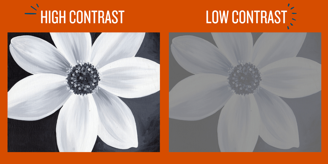
High-value contrast and low-value contrast are the yin and yang of color theory in photography. High-value contrast creates bold, striking differences between light and dark elements, adding drama and impact. On the other hand, low-value contrast involves subtle variations, providing a more muted and harmonious aesthetic. Experiment with both approaches to find the contrast level that complements your photographic narrative.
HSV Scale and How You Can Use It
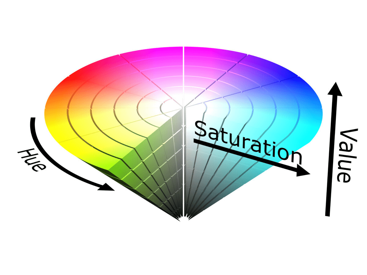
The HSV scale, representing hue, saturation, and value, is a powerful tool for photographers. It allows you to fine-tune the colors in your images, adjusting the intensity and brightness. Understanding the HSV scale enables you to control color tones, achieving the perfect balance for your photographic vision. Experiment with this scale to bring out the vibrancy of primary colors in photography and create images that resonate with visual richness.
The Difference Between Monochromatic and Grayscale
-Monochromatic photography involves utilizing variations of a single color, creating a cohesive and focused visual experience. This technique emphasizes the subtleties within a specific hue, offering a harmonious and restrained aesthetic. For example, capturing a seascape in various shades of blue through monochromatic photography can evoke a serene and tranquil atmosphere.
-Grayscale photography boldly removes color, emphasizing the interplay of light and shadow with a focus on black and white. This classic technique has a timeless appeal, often evoking a sense of nostalgia or drama. When capturing architectural details or portraiture, the absence of color enhances textures and expressions, revealing the raw essence of the subject.
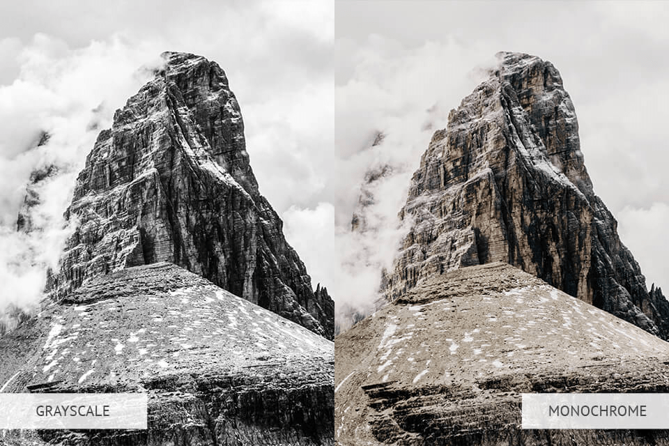
The decision to opt for monochrome or grayscale depends on artistic goals and the emotional resonance one wishes to convey. Monochromatic photography is ideal for creating a cohesive and soothing visual experience, working well for minimalist compositions or subjects where variations in a single color tell a compelling story. Conversely, grayscale photography is a powerful tool for emphasizing light and shadow, adding drama or a vintage aesthetic. It’s effective for street scenes, accentuating contrasts between illuminated areas and shadows to create a captivating narrative with a touch of mystery. Experimenting with both techniques allows photographers to refine their artistic voice and connect with viewers in distinct ways.
What Is White Balance?
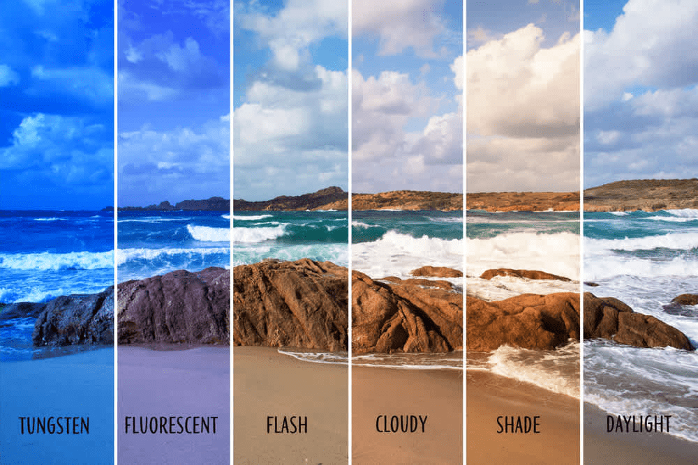
Understanding white balance is crucial for achieving accurate and natural colors in your photographs. It involves adjusting the color temperature to neutralize any unwanted color casts. The primary colors in photography come to life when the white balance is spot-on. Most cameras have the ability to change the white balance to better suit your scene. I suggest experimenting with different white balance settings based on the lighting conditions, ensuring that your images represent the true essence of the scene.
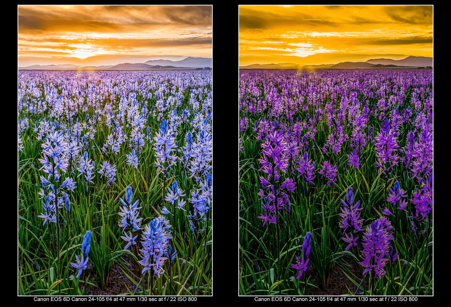
Color Temperature: What is it?
Color temperature, measured in Kelvin (K), is a pivotal element in setting the mood of your photographs by defining the warmth or coolness of the light source. This scale ranges from warm to cool, with lower Kelvin temperatures (around 2000-4000K) producing inviting, cozy atmospheres, like the golden hour at sunset. In contrast, higher Kelvin temperatures (5000K and above) create cooler tones, evoking a sense of calm and tranquility, such as the serene blue tones during twilight. Understanding and manipulating color temperature adds an extra layer of storytelling to your images, allowing you to convey specific emotions through primary colors in photography. The next time you capture a moment, consider the dynamic role color temperature plays in shaping the narrative and atmosphere of your visual story.
What Emotions Do the Different Colors Represent?
Colors are not just visual elements; they are emotional triggers. Knowing the emotions associated with different colors empowers you to convey specific feelings in your photographs. Experiment with the emotional impact of primary colors in photography to create images that resonate deeply with your audience. Here’s a bulleted list of the top colors used and the emotions or feelings they convey:
Red:
Emotion: Passion and Intensity
Feeling: Energy and Excitement
Blue:
Emotion: Calmness and Serenity
Feeling: Tranquility and Peace
Yellow:
Emotion: Cheerfulness and Positivity
Feeling: Warmth and Happiness
Green:
Emotion: Harmony and Freshness
Feeling: Balance and Growth
Purple:
Emotion: Royalty and Luxury
Feeling: Elegance and Mystery
Orange:
Emotion: Vitality and Creativity
Feeling: Playfulness and Enthusiasm
Pink:
Emotion: Romance and Tenderness
Feeling: Affection and Sweetness
Black:
Emotion: Sophistication and Mystery
Feeling: Power and Elegance
Experimenting with these color-emotion associations will add layers of depth to your photographic storytelling, allowing you to evoke specific responses and connections from your audience. If you want to learn more about the different colors click here.
Final Note on Color
Remember, colors are your storytelling allies. Whether you’re playing with primary colors, adjusting color values, or exploring emotional nuances, understanding color theory enhances your ability to communicate through images. So, let your creativity flow, experiment fearlessly with color, and watch as your photographs come alive with vibrant hues and meaningful narratives. Happy shooting! For more information about photography click here.